 Self Publishing isn’t just about the creative act of writing a book or getting to grips with the technical side of putting your words online and in print. Every self-published author has to navigate the swamp of self indulgence that is The Book Cover. And some navigate it better than others…
We’ve all seen them on Amazon. Book covers that look like everyone else’s book cover or, worse still, covers whose composition just screams AMATEUR!!!
Now, I’ll admit, I’m not a professional cover designer either. But I know a crap cover when I see one. And so do you. Generic stock photo covers and fancy fonts that a professional publisher would never use are a dead giveaway, instantly marking out your thumbnail as “Self-Published”. And the recent rise of AI generated art has only made the problem worse. These days, too many book covers all look the same, regardless of genre.
The silhouette of the hero with his back to the camera, walking away from the reader? Does every “thriller” need to have a variation on that style of cover? Does every “paranormal romance” need to have a muscle-bound hunk and/or a beautiful heroine with an ample cleavage surrounded by coloured clouds of ethereal energy? No, they don’t. But every genre has its conventions, and that includes associated imagery.
When it came to my own books, even before I started writing, I was aware of the problem that is The Cover. In order to solve it, I went for the easiest option, which was a Text Cover rather than an Image Cover.
If I’d gone with an image cover, then for each successive book, I would have needed to source yet another similar image in the same sort of style. That can quickly turn into a trap if you want to do something new or different. And you can waste hours trying to find just the right image. Knowing how easy it is to lose hours of your life looking at funky Fonts, I knew that an image-based cover was a mantrap best avoided. And as someone afflicted with The Fan Gene, I understood the importance fans place on consistency. Which was why I created a text-based template for book one and stuck with it so the spines all looked the same on the shelf.
I’m not entirely sure about the truth of this, but I think I was influenced by two things.
In general terms, the consistency on the shelf of Classic Dr Who DVDs, and yes, I own them all. For the more recent animated releases, released after the range itself had ended, they have a “modern” full image cover and, on the reverse, a “retro” cover that matches the style of the original run. Fans love consistency, which brings me to my next probable influence, Jodi Taylor. Like all good book series, such as Skulduggery Pleasant, her books all have the same consistent look, same typeface/font and same colour scheme.
I think it was a subconscious preference for both those consistencies that led me to the image-based cover template that I still use. But, although it saves me hours that I would otherwise have wasted trying to get the “right” image for the cover, that doesn’t mean to say it can’t be improved on.
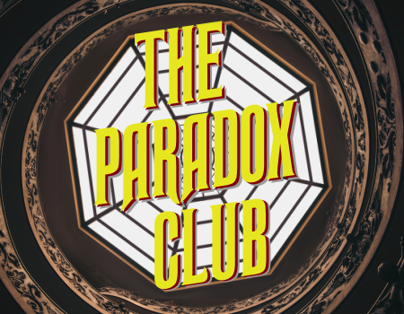
Here are the original covers for Books One to Five…
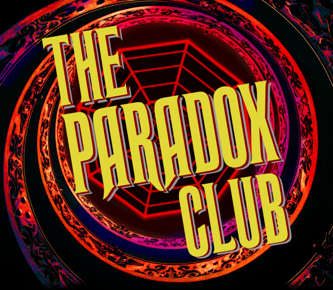
 The background octagon came from a stock photo I found online, which I then augmented. It’s the spiral staircase at the Vatican, if you think you recognise it, and the octagon in the centre is the window above. I tweaked it to make it a bit more “web of time” and that was my background for the book covers.
Since I knew I would be using a text-based cover, I worked my way through various fonts, trying things out until I found one that I liked. The font in question is Ravenscroft, and it’s either very similar to, or the same as, the one used for the opening titles of Jeremy Brett’s Sherlock Holmes adventures on the telly.
The title text of each book has three layers, grey at the back, red in the middle and yellow at the front.
At the time I came up with it, I was more than happy with it. The text stood out against the background, it worked in terms of consistency, and it worked as a thumbnail on Amazon. But you know how it is, over time you start to think that maybe it’s not as good as you initially thought it was. Not that it needs changed, but it could be improved…
It was while I was working on Book Five that I had a rethink when it came to the covers. For one thing, the storytelling was rather darker than I thought it would be when I started, with all sorts of horrible things happening. I felt that ought to be reflected in the covers. If the content was a bit darker than I thought it would be, then maybe the covers should reflect that. I tried darkening the octagon in the middle and that worked better than the white, but it still wasn’t quite right.
I knew I could make the covers better, especially when I realised that having the red text layer at the front instead of the yellow worked much better on the white backgroud. I knew I was heading in the right direction and, after a few experiments with different things, I finally nailed it.
And so here are the revised covers for books One to Five…
 I like these covers a lot more than the originals, and the covers of the upcoming books in the series will be in the same style as these. The yellow text stands out a lot more than it did on the original iteration, and I like the additional colour on the background.
To my mind, it sort of evokes a Drosten Clock or a spiral galaxy with the Web Of Time at its centre. It would probably look good animated… which might be an idea for my planned YouTube channel, when it finally happens! I’m glad I came up with this revised cover design this early in the self-publishing process, as it minimised the number of covers I had to redo and upload to Amazon all over again.
I just wish I’d thought of it earlier!